
Sign me up!
Today I have a new project making signs that can be hung on a bedroom door or on a wall as a decorative item. This is a lot of fun to make and you can vary your sign to fit any home decor, age group or person!
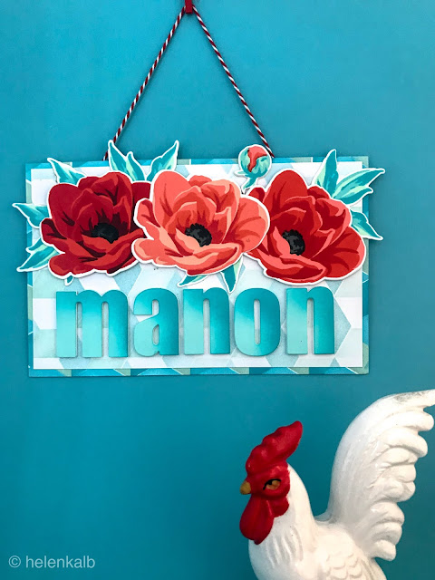
For this sign I used one of my newest Altenew sets; the beautiful Hope with the gorgeous peonies that I am pretending to be poppies here in honor of the real life Manon.
The tutorial will show in detail how to make this using several techniques and giving you many tips along the way.
Feel free to contact me via the comment section if you have any questions at all!

Before we start, if you'd like to see more inspiration for a sign, please go to this post; Another sign and check it out.
Tutorial in nine steps
Let's get started! The supply list for this project can be found at the very end of this post.
Step 1 - die cutting the letters
Since the number of letters in the name or word you are writing on your sign will determine the size of your panel, the first step is to cut out all the letters.
To make the letters sturdy and thick, I cut each one three times out of 110 lb card stock using the Bold Alphabet Dies. Each letter is then glued together in a stack to form a sturdy card board letter.

TIPS for the letters

Now it's time to stamp the images you will use to complement the letters. I used my MISTI since I needed several flowers and mass production is a breeze using this stamping tool!

The layering guide on the back of the packaging is helpful for lining up all the images correctly and to figure out how many different colors of ink are needed to stamp the images. This set is very easy to line up!
Oh, and I love the way these flowers look using just the first layer!

TIPS for stamping

The leaves have three layers and I stamped them in Minty Mint for the base layer, Sea Glass for the middle and Ocean Waves for the final layer.
I stamped a total of 6 flowers, 6 flower buds and 8 leaves. I only used 3 of the flowers, 1 of the buds and 4 leaves for my sign but I also made a matching card, you'll see it at the end of this post.
Now die cut all the flowers, leaves and buds.
Cut two extra layers for each image out of white card stock for layering. Once all the images are die cut, stack them together with liquid glue to create sturdy cardboard-like flowers and leaves, just like the letters above.

TIPS for die cutting
To calculate the length of your finished sign, line up the letters on your work surface and measure the length of the word, then add 1 or 2 inches to that measurement - that will be the length of your board.
Example: For my sign, "manon" measured 5.5 inches, I added 1.5 inches and cut a board 7 inches long.
For the height of the sign I knew I wanted to add a flower border at the top so I took some of my die cut flowers and positioned them above the letters on my work surface and thus came up with a measurement of 4.5 inches.
DESIGN TIP
Step 5 - ink blending the background panel through a stencil
The base panel will have blending on the outer edges only, in darker shades of ink. The smaller card stock panel will have very light ink blending on the whole panel.
I wanted the background pattern to match the leaves of the flowers so I used the same color Crisp Inks to blend through the Cube Builder stencil onto the base panel.

TIPS for blending the first color through the stencil

TIPS to complete the pattern
Blend the card stock piece in the same way as the panel but with lighter shades of ink and a much lighter hand.

TIPS for blending the background card stock


TIPS on how to glue down your flower arrangement


Here is a closeup of the flower cluster and the dimension on the card.

This is my final assignment for Level 2 in the Altenew Educator Certification Program, the AECP, the task this time was to make some sort of home decor and produce a tutorial.
I really enjoy stretching myself and my card making supplies to make things that are not cards. A little while back, I made little hangings in a post I called Spring in the house and at the beginning of the year I made a calendar. Click the links to check out those projects.

Supply list
From Altenew:
Hope stamp set and corresponding dies
Bold Alphabet Dies
Cube builder stencil
Crisp Inks, for the flowers
Pink Pearl
Coral Bliss
Heart Beat
Vineyard Berry
Industrial Diamond
Pure Graphite
for the leaves and backgrounds;
Minty Mint
Sea Glass
Ocean Waves
Aqualicious
From other suppliers;
MISTI or another stamp positioner
Tonic easy clean craft mat (or a sheet of scrap paper)
Blending tool
Liquid glue
Scotch tape
Bakers twine
Neenah solar white 110 lb card stock.
Heavy card stock for the base panel - I went to my local craft store and bought some beautiful Strathmore 400 Bristol card, see the beautiful makers impression below.


For this sign I used one of my newest Altenew sets; the beautiful Hope with the gorgeous peonies that I am pretending to be poppies here in honor of the real life Manon.
The tutorial will show in detail how to make this using several techniques and giving you many tips along the way.
Feel free to contact me via the comment section if you have any questions at all!

Before we start, if you'd like to see more inspiration for a sign, please go to this post; Another sign and check it out.
Tutorial in nine steps
Let's get started! The supply list for this project can be found at the very end of this post.
Step 1 - die cutting the letters
Since the number of letters in the name or word you are writing on your sign will determine the size of your panel, the first step is to cut out all the letters.
To make the letters sturdy and thick, I cut each one three times out of 110 lb card stock using the Bold Alphabet Dies. Each letter is then glued together in a stack to form a sturdy card board letter.

- keep any leftover letters in the storage pouch with your dies for future use, you can see how I have several colored letters in mine
- use up scraps of card stock for die-cutting smaller shapes and letters - no waste!
- use liquid glue to stack the letters and wiggle them into matching shapes using your fingers
- leave to dry under a heavy acrylic block or a book while you work on your stamped images
Step 2 - making exact shade of card stock
I wanted the letters of my sign to be the exact same shade as one of the inks used on my project, the way to achieve this is to directly smear ink from the ink pad on to the card panel. I made two pieces of card stock in different colors as I was not sure which color I wanted my letters to be. In the end I went with the Dew Drops blue.

TIPS for custom coloring card stock
- Smear ink generously over the whole panel, the color will get lighter as it dries
- Leave to dry completely before die cutting - use a heat tool if you are in a hurry
- Glue the colored paper layer onto each of the letters and leave to dry under a weight
- When the paper is thoroughly dry, die cut the letters and glue to the top of the white letters as above
Now it's time to stamp the images you will use to complement the letters. I used my MISTI since I needed several flowers and mass production is a breeze using this stamping tool!

The layering guide on the back of the packaging is helpful for lining up all the images correctly and to figure out how many different colors of ink are needed to stamp the images. This set is very easy to line up!
Oh, and I love the way these flowers look using just the first layer!

TIPS for stamping
- with a brand new stamp set, to ensure a good impression, rub the stamp surface with your thumb to make it a bit matte in appearance before inking up
- stamp each layer twice in the lightest color ink, then rotate the card stock in the MISTI and stamp again to make two flowers on one piece of card stock
- make flowers in varying shades of red by stamping the base layer in a darker colored ink (this is why my flowers are all different shades even though I used the same ink colors)
- if you don't have enough red ink colors, use the same color for two subsequent layers, or use a neutral gray or brown ink for a darker layer
- make sure to look straight down through the image to ensure exact placement of the layers

The leaves have three layers and I stamped them in Minty Mint for the base layer, Sea Glass for the middle and Ocean Waves for the final layer.
I stamped a total of 6 flowers, 6 flower buds and 8 leaves. I only used 3 of the flowers, 1 of the buds and 4 leaves for my sign but I also made a matching card, you'll see it at the end of this post.
Now die cut all the flowers, leaves and buds.
Cut two extra layers for each image out of white card stock for layering. Once all the images are die cut, stack them together with liquid glue to create sturdy cardboard-like flowers and leaves, just like the letters above.

TIPS for die cutting
- to line up your die, look straight through the die to make sure the stamped image is cut in the correct place
- even though I am using a magnetic platform I also tape down the dies to the paper - I use micropore tape but you can use washi or any other low tack tape for this, keep the tape on the outside of the image if possible
To calculate the length of your finished sign, line up the letters on your work surface and measure the length of the word, then add 1 or 2 inches to that measurement - that will be the length of your board.
Example: For my sign, "manon" measured 5.5 inches, I added 1.5 inches and cut a board 7 inches long.
For the height of the sign I knew I wanted to add a flower border at the top so I took some of my die cut flowers and positioned them above the letters on my work surface and thus came up with a measurement of 4.5 inches.
DESIGN TIP
- For an added bit of design interest, have some of the leaves and buds end up outside the border of your sign - take this into account when you decide on the size of your base panel!
Step 5 - ink blending the background panel through a stencil
The base panel will have blending on the outer edges only, in darker shades of ink. The smaller card stock panel will have very light ink blending on the whole panel.
I wanted the background pattern to match the leaves of the flowers so I used the same color Crisp Inks to blend through the Cube Builder stencil onto the base panel.

TIPS for blending the first color through the stencil
- For easier blending and clean up and also to protect your work surface, use some kind of craft mat or a sheet of scrap paper
- Hold the stencil in place using Post-It tape or a Post-It note
- Use a make up brush for blending, mine is a very cheap brush from a local drug store and it works really well
- You can also use make up sponges or a Ranger ink blending tool or ink daubers for blending your ink onto the paper
- As the stencil is smaller than the panel, you will need to move it around, carefully line it up to make the pattern as regular as possible
The images below show the blending of the second and third colors.

- Clean the stencil with water and a paper towel before switching ink colors
- Turn the stencil to blend on a second color and then again the third
- Avoid touching the blending with your fingers, use the Post-It tape to hold the stencil down firmly
- Don't pay attention to the middle section of the panel, it will be covered by another sheet of card stock
Blend the card stock piece in the same way as the panel but with lighter shades of ink and a much lighter hand.

- Use a very light hand for added contrast
- Blend all over the panel
- Check along the way that the panels go together nicely
- I decided to use only two colors of ink and left the final part of the pattern white

Step 7 - placing the letters and flower elements
After aligning the letters, glue them towards the bottom of the sign, then make a trial arrangement of the flowers and leaves in a cluster at the top of the panel.

TIPS for aligning the letters
- Line up the letters on your work surface
- Use masking tape to pick them up and flip them over
- Add liquid glue to the back of the letters and turn them onto the panel
- Carefully remove the masking tape and use a T-ruler to make sure the letters are straight
- Work fast! The liquid glue leaves some wiggle room and time to move the letters around and place them in the exact right spot
- Place an acrylic bloc on top until they are dry
Proceed with arranging and glueing down the flower cluster above the letters, remember to let some of the pieces hang over the side. As they are layered with white card stock they are sturdy enough.

- Take a picture with your phone to remember what it should look like!
- Carefully lift off the top elements, in this case the three flowers
- Glue down the leaves and the bud to the board using your pic as a reference
- Use leftover stacked letters as support for the flowers - see the letter "l" in the top right pic
- Leave to dry under an acrylic block
- Add the two exterior flowers and glue down and let dry under the acrylic block
- Finally add the third flower in the middle section using other pieces of cardboard letters to support it underneath - you do not want the flowers to sag!

The letters on my sign looked very pale and washed out against the beautiful, red flowers but I had enough of my custom blue card stock from step 2 above to die cut out the letters one more time.
I blended the darker shade of Aqualicious on the top and right hand side of these letters, then glued them down and weighted them under the acrylic block.
Step 9 - completing the back of the sign
Finally, I cut a length of bakers twine and stuck it down with some tape to the back of the panel. I then glued down my second piece of card stock from step 4 above, let it dry under my MISTI this time for about 20 minutes before stamping my signature on the back.

Finally, I cut a length of bakers twine and stuck it down with some tape to the back of the panel. I then glued down my second piece of card stock from step 4 above, let it dry under my MISTI this time for about 20 minutes before stamping my signature on the back.

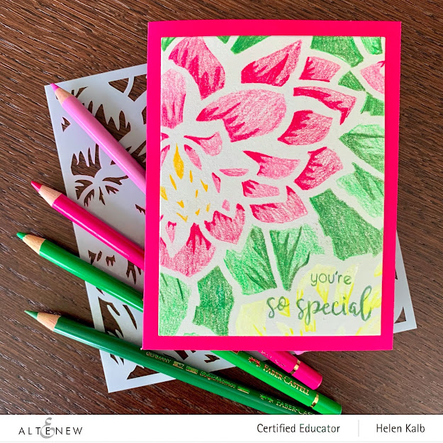
I also made a card to go along with the sign, using a couple of the leaves, a flower and a bud mounted on a white card where I had dry embossed a simple frame. The sentiment is also from the Hope stamp set.

Here is a closeup of the flower cluster and the dimension on the card.

I really enjoy stretching myself and my card making supplies to make things that are not cards. A little while back, I made little hangings in a post I called Spring in the house and at the beginning of the year I made a calendar. Click the links to check out those projects.

If you liked this post, please leave a comment below or perhaps click the subscribe button above to receive an email whenever I post new projects on my blog!
Supply list
From Altenew:
Hope stamp set and corresponding dies
Bold Alphabet Dies
Cube builder stencil
Crisp Inks, for the flowers
Pink Pearl
Coral Bliss
Heart Beat
Vineyard Berry
Industrial Diamond
Pure Graphite
for the leaves and backgrounds;
Minty Mint
Sea Glass
Ocean Waves
Aqualicious
From other suppliers;
MISTI or another stamp positioner
Tonic easy clean craft mat (or a sheet of scrap paper)
Blending tool
Liquid glue
Scotch tape
Bakers twine
Neenah solar white 110 lb card stock.
Heavy card stock for the base panel - I went to my local craft store and bought some beautiful Strathmore 400 Bristol card, see the beautiful makers impression below.

The paper came in a very big sheet so I asked the store to cut it up for me into pieces that were more manageable. I was a bit worried about cutting the thickness of this paper and prepared myself to use a cutter but my trusted Fiskars cutter did the job beautifully!

hugs,
Helen


Wow, Helen, you sure have knock this challenge out of the ball park! Your write-up and detailed descriptions are awesome! This wreath is absolutely gorgeous! Your craftsmanship and process photos are so beautifully done! Love your share of tips and techniques, too! If you look through your first few AECP entries and today's post, you will see the growth and progression! I am so very proud of you and believe that you have what it takes to become an Altenew Educator! You are reaching a milestone for sure! BRAVO! I am so glad that you enter your beautiful work in Altenew AECP assignment Gallery. Awesome details and design! Super work!
ReplyDeleteSo happy and thankful for your lovely comment Virginia!
DeleteWOWZERS Helen!! You did such a fabulous job! This is outstanding, fantastic and so much more! I love that you included process photos and the way you shared the process of the entire project from start to the end.
ReplyDeleteI am blown away. So good!
Thanks so much for entering your beautiful work in the AECP assignment Gallery. I love your write-up and descriptions! Please keep up with your excellent work!
Thanks Erum, I am so happy you like my work :)
Delete