
A distraction!
I had a card all planned out for this post but then I got distracted by the technique, the possibilities and the fun of creating and my well thought out plan turned into something else... I am sure I am not the only one this has ever happened to!?
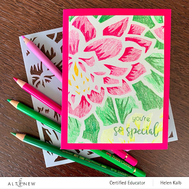
In fact I have two cards for you today, the first one is directly inspired by a great class taught by Kelly Latevola at the Altenew Academy. Like one of the comments on the class said; "This whole course was so enjoyable and packful with tips and tricks. Can’t wait to try them all!"

The class is called One-layer Wonders, but I mounted my images onto a separate piece of card stock just because I like the frame effect. My cards are not strictly one layer but they are still quite flat and will mail easily without extra postage.

This card is directly inspired by Kelly's card in lesson 3 but she used a different flower image. The main difference is that I am a beginner water colorist and she is a pro - I'll keep practicing!

The technique of "Watercolor Under Painting" used for this card is done with Distress Inks and then details and shadows are added with Alcohol markers. It goes through stages of looking hideous (yes, this is the truth!) but in the end I am quite happy with this card.

Kelly goes over the stamped outline with a black pen and likes to draw a frame on her project to complete it.
I do like the very black line of the outline, it really defines the image and makes it pop.
I also really liked the frames on Kelly's cards, however I think I didn't "own" the line enough to draw it in boldly. I completely ruined a card with my first attempt - LOL!

As I had my watercolor paper out and the beautiful Sketchy Floral stamp in my MISTI, I stamped out several images, turning the paper different ways for a slightly different composition.

So the second card I decided to heat emboss in white and do some water coloring with my Gansai Tambi.

The blue background was also an inspiration from Kelly's class, she used alcohol markers which I don't have a lot of. As the Gansai Tambi colors are almost gouache like in texture I quite easily got the blue to cover the background like I wanted it to.

It's difficult to see in the pics, but the leaves are painted in gold, gives a bit of a cloisonné effect. Once the watercoloring was completely dry I heat embossed the greeting in white detail powder.

What do you think of my cards? Do you have a preference? Please let me know in the comments below.

This is the class I took and that inspired me for these cards.You can find this and other Altenew Academy classes on the Altenew website and blog.

And while you are there, check out the AECP, perhaps you'd like to work your way towards becoming an Altenew Educator like I am doing!

By the way, did you notice the lovely peonies in the pics? I might have to stamp some too!

Hugs,
Helen
In fact I have two cards for you today, the first one is directly inspired by a great class taught by Kelly Latevola at the Altenew Academy. Like one of the comments on the class said; "This whole course was so enjoyable and packful with tips and tricks. Can’t wait to try them all!"

The class is called One-layer Wonders, but I mounted my images onto a separate piece of card stock just because I like the frame effect. My cards are not strictly one layer but they are still quite flat and will mail easily without extra postage.

This card is directly inspired by Kelly's card in lesson 3 but she used a different flower image. The main difference is that I am a beginner water colorist and she is a pro - I'll keep practicing!

The technique of "Watercolor Under Painting" used for this card is done with Distress Inks and then details and shadows are added with Alcohol markers. It goes through stages of looking hideous (yes, this is the truth!) but in the end I am quite happy with this card.

I do like the very black line of the outline, it really defines the image and makes it pop.
I also really liked the frames on Kelly's cards, however I think I didn't "own" the line enough to draw it in boldly. I completely ruined a card with my first attempt - LOL!

As I had my watercolor paper out and the beautiful Sketchy Floral stamp in my MISTI, I stamped out several images, turning the paper different ways for a slightly different composition.

So the second card I decided to heat emboss in white and do some water coloring with my Gansai Tambi.

The blue background was also an inspiration from Kelly's class, she used alcohol markers which I don't have a lot of. As the Gansai Tambi colors are almost gouache like in texture I quite easily got the blue to cover the background like I wanted it to.

It's difficult to see in the pics, but the leaves are painted in gold, gives a bit of a cloisonné effect. Once the watercoloring was completely dry I heat embossed the greeting in white detail powder.

What do you think of my cards? Do you have a preference? Please let me know in the comments below.

This is the class I took and that inspired me for these cards.You can find this and other Altenew Academy classes on the Altenew website and blog.

And while you are there, check out the AECP, perhaps you'd like to work your way towards becoming an Altenew Educator like I am doing!

By the way, did you notice the lovely peonies in the pics? I might have to stamp some too!

Hugs,
Helen


I cant pick one! I love both of them! Super gorgeous work Helen!
ReplyDeleteThank you for entering your beautiful work to the AECP assignment gallery. Well done.
Ah thanks Erum!
DeleteOh Helen, these two gorgeous cards are so different from your norm, but you really captured the essence of this course from Kelly! Love the inking and mix of Oxide! Thanks so much for entering your beautiful work in Altenew AECP assignment Gallery. Beautiful colors and design. Well done!
ReplyDeleteThey are different for me, Kelly's class truly inspired me!
Delete